Video CTAs: How to Get Your Customers to Act
Marketing videos are only part of the puzzle. Learn how to use a call-to-action that works with your videos and gets your customers to take action.
Video CTAs:
How To Get Your Customers To Act
Image via: Noble Bison Productions
Every business has actions they want their customers to take, like purchasing from their seasonal sale, reading blogs, subscribing to a newsletter, and plenty more. And the way in which we communicate these actions with our audience is through what’s called a “Call to Action.”
What exactly is a Call to Action (CTA)?
A CTA is the marketing term for the prompt or command that tells a user a specific action to take. While our content itself may lead our audience in the right direction, it’s been found that attaching clever CTAs to your content has been proven to boost conversions, subscriptions, and more. Yes, videos are the most effective type of content to interact with and engage your audience, but it’s only part of the puzzle. The two bounce off each other; videos give viewers the visual story, emotion, and interest, and then CTAs drive the response.
Since Noble Bison Productions works with businesses to create marketing videos, we know how important CTAs are to our clients’ marketing content. We often suggest CTAs as final tips in our video content blogs, so it felt necessary to write a full piece on how to best use CTAs with your video marketing. Below we’ll dig into different types of CTAs and certain techniques that can increase your overall click-throughs.
Different Types of CTAs:
The type of CTA you should use depends on what it is attached to. You want to think of CTAs as a way of holding your customers’ hands and guiding them to specific places. Therefore, certain CTAs are more appropriate based on where your customer is at in the sale funnel.
Have they only just heard about you?
Are they returning customers?
These are important things to consider when creating effective CTAs. Always think about who your audience is in any given space because it will help you decipher the most effective verbiage to use for your CTA. Let’s look at the following types of CTAs and where they are most fitting.
SOFT CTAs
Soft CTAs are used when a visitor is just discovering you and your products or services. This type of CTA is best for encouraging users to see what you’re about and explore what you offer. They guide customers to do “softer” actions like follow you on social media or sign up for a newsletter. You want these users to consume your free and digestible content, like reading your blogs, visiting your About or FAQs pages, etc. It doesn’t ask them to make a purchase or commit to anything too serious. Once they get to know your brand and products/services better, they may be more likely to continue down the sales funnel and make a purchase from you.
Soft CTAS are typically attached to videos such as explainers, brand anthems, and other introductory style videos. They can also be included in your DIY video content that is more personalized and less in-your-face-marketing style content.
HARD CTAs
These, as you may have guessed, are the opposite of soft CTAs. They direct your customers to actionable places where they can get in touch with you or purchase a product. The prime reason the two are different is that, again, they focus on where your audience is in the sales funnel.
Hard CTAs are used when customers are watching product videos, like a demonstration. To give an example, let’s say you wrote a book and you want your social media followers to buy it. You should attach a hard CTA to buy your book after posting an interview or a video of you speaking about the book. Hard CTAs tell customers to take the main action that you want them to — i.e. generally, a final purchase or a step close to that.
CTA TIPS & TECHNIQUES:
Placement Matters
QuickSprout found that CTAs within their videos received 380% more clicks than their sidebar CTAs. However, we suggest placing a CTA within your video and around it, as suggesting a click, swipe, or certain action more than once can be extremely effective.
Don’t let your audience leave without seeing and/or hearing your call to action. The more accessible and noticeable your CTAs are the more likely your audience will interact with them.
Make It stand out
Not only do CTAs in the form of a button increase conversions but using a larger size and a contrasting color can also increase your conversions. Look at the three different types of buttons below. Which one stands out the most to you?
Obviously, the orange one is the most eye-catching. Many businesses have reported orange or red or other brightly colored buttons increased their click-through rates. The main takeaway is that especially when using customizable buttons for your CTAs, contrast is important. Make them stand out!
CTAs that aren’t in button form, like perhaps a call to action on your social media platforms, also need to stand out. And since you can’t exactly manipulate the style of these CTAs, the language you use is extremely important.
Language Matters
Every CTA should be very clear, as any confusion or ambiguity can quickly lose you a customer. CTAs are not the right time to use passive language. Instead, it’s best to use action words that are direct and concise.
Good buzzword CTAs that are often used:
Get Yours Now
Start Today
Try for Free
Join Us
Sign Me Up Now
Claim Yours
Discover More
Interestingly, ContentVerve reported a 90% increase in click-through rates by using first-person CTAs. For example, Start My Free Trial vs. Start a Free Trial. Another interesting technique is using a question that your customer may be asking. It’s a great way to play with language and get your customer clicking. I included a good example of this in the list of examples below.
Test Your CTAs
Every business is unique. CTAs are specific to not only your business but also your ideal customers. The language, style, and placement can all vary across different businesses. With that, you need to explore what works best for you and your customers. Run A/B tests and see what your customers respond to most. Much of marketing, especially for small businesses, is trial and error. But it is worth taking the time to figure it out, as CTAs are one of the most integral parts of successful marketing. Take these tips and techniques and make them your own!
Call To Action EXAMPLES:
Now that you know more about how CTAs work, you can keep an eye out for the different ways other businesses use them. There are some pretty clever ones from companies big and small that I’ll include below. Maybe they can help you get your juices flowing. The following examples are website CTAs that appear above the fold, meaning the visible part of a website’s page before you scroll down.
talking shrimp:
CTA: “me want”
Above is Laura Belgray’s website, Talking Shrimp. She’s a well-known copywriter and one of my favorites to keep up with. Here, you can see her renowned copywriting skills in action, as she uses humor and color and style to entice her website visitors to click her CTA. It worked on me, anyway. Once you sign up for her free emails, she can then market her programs and content that are for purchase. So, this is considered a soft CTA. Most website header CTAs are soft.
prAna:
CTAs: “New Arrivals for Her” / “New Arrivals for Him”
This is prAna’s current website. I included this one as an example because it shows how some businesses change their CTAs based on their new products. In this case, they entice their visitors with seasonal items. The word “New” is a great CTA buzzword, especially for those who love to shop. Once again, this is a soft CTA. After visitors explore their products, then they can use hard CTAs like “Add to Basket.”
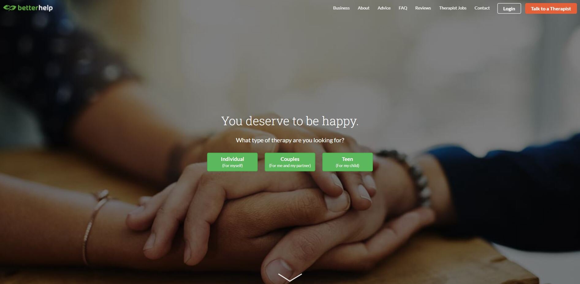
BetterHelp
CTAs: Individual/Couples/Teen
BetterHelp, an online therapy service, has three CTAs. This is clever because BetterHelp knows they have different customers. Each CTA brings a specific type of visitor to the right place for them to continue the process of receiving therapy. It shows that they have considered their audience and want to guide them in the right direction to get help.
Wyndly
CTA: “Am I A Candidate?”
One of our past clients, Wyndly Health, helps people to beat their allergies. Their CTA is great because it asks a question, one that their website visitors are likely thinking. Using a question for your CTA is a wonderful way to get people exploring and digging deeper into your website. It can also help businesses to learn more about their visitors.
Have questions about video CTAs? Or do you need high-quality videos that get your customers interested? Drop us a line below:
(Yes, I am using our orange button for this CTA)
NOBLE BISON PRODUCTIONS
A DENVER VIDEO PRODUCTION COMPANY
BROADCAST COMMERCIALS - MUSIC VIDEOS - BRAND VIDEOS - FILMS - ANIMATION & MOTION GRAPHICS - DRONE FOOTAGE - BRAND VIDEOS - WEBSITE BANNERS - SOCIAL MEDIA VIDEOS - CORPORATE VIDEOS- DEMOS - EXPLAINERS
Have more time for reading? Check out these related blogs:


